Local service business · Beauty & wellness
Dorking Solarium
A calm, confident website for a local salon that needed to feel cleaner, more premium, and easier to trust.
A calm, confident website for a local salon that needed to feel cleaner, more premium, and easier to trust.
- Client
- Dorking Solarium
- Industry
- Local service business · Beauty & wellness
- Year
- 2026
- Role
- Brand & website lead — design, build, copy
The core idea
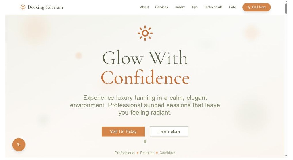
The website does not need to do more. It needs to remove hesitation.
A small website, made carefully, can change how a small business is seen. The work was less about adding and more about quietly removing every reason not to call.
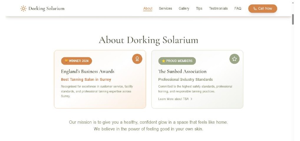
FIG. 02 · Trust signals
Industry membership and the local award sit beside the salon's mission, not above it — present, but never the loudest thing on the page.
By the numbers
- Cream
- #F4EFE7
- Deep Sage
- #1F2620
- Sage
- #5C6B5A
- Bronze
- #B86A3D
- Hairline
- #D9D5CE
- Live
- Designed, built, shipped
Overview
Dorking Solarium is an independent sunbed salon serving Dorking and the wider Surrey area — premium MegaSun standing and lay-down beds, professional tanning products, and a calm, well-kept environment. The customer is predominantly local and decides quickly, usually on a phone, often before ever calling or visiting. The brief was simple: treat a small local business with the same restraint, typography and commercial care normally reserved for a much larger brand.
The problem
01
Local beauty businesses are not lost on features. They are lost on tone.
Most local salon sites quietly lose the booking before it starts — dated layouts, low-resolution photography, buried pricing, weak hierarchy, a phone number that's hard to find, and a tone that reads cheap or generic. What customers are really looking for is reassurance the place is clean and cared for, confidence the equipment is current and professional, clear opening hours and contact details, and a visual tone that feels legitimate and worth trusting.
The insight
02
The website does not need to do more. It needs to remove hesitation.
This isn't a complex feature problem; it's a trust-and-friction problem. Customers want quick answers — what does it look like, what does it cost, when is it open, how do I get there, can I trust this place. Typography, spacing and photography do more trust work than sales copy ever could. The job was to remove every micro-doubt between landing and lifting the phone.
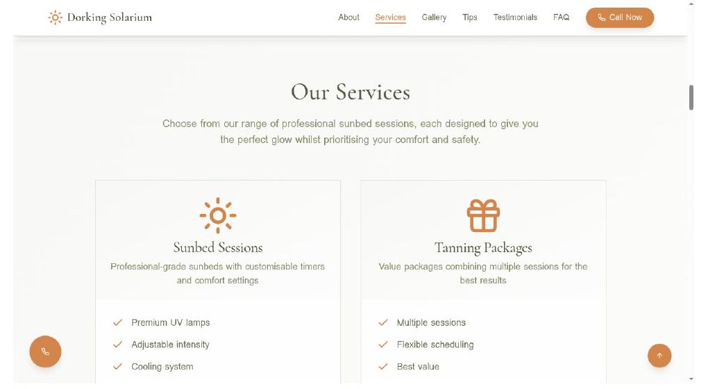
FIG. 03 · Services
Symmetrical pairing, calm icons, no decorative noise. Each card answers a single question: what is it, what's included, why it's worth it.
The concept
03
Premium but approachable. Modern, but not over-designed.
Three intentions, in order. Reassure — make the salon feel clean, cared-for and current within the first two seconds. Modernise — quietly elevate the typography, palette and spacing above local category norm. Convert — make the phone call the easiest action on every screen, on every device.
The product experience
04
A deliberate sequence, not a list of sections.
The site moves through a simple, considered order: who the salon is, what is offered, what the space looks like, what existing customers say, and how to get in touch — in that order, because that's the order in which first-time customers actually ask. Trust signals (industry membership, local award) sit beside the mission, not above it.
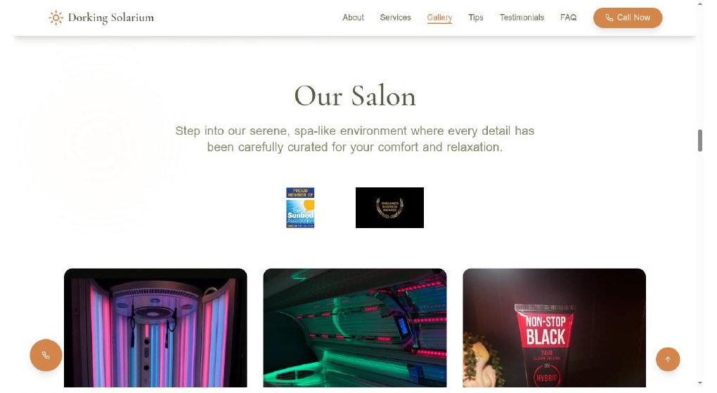
FIG. 04 · Salon gallery
Real photography of the new MegaSun beds carries more trust than any tagline. The design steps back; the room is the proof.
The visual system
05
Cream, deep sage, and a single bronze accent.
A high-contrast serif for display, paired with a quiet humanist sans for UI and body. Generous titles, restrained weights, mobile-readable body copy. Real photography of the actual salon and MegaSun beds — the design frames the photography rather than competes with it. Plain-spoken British English throughout: calm, factual, warm, no hype, no unverifiable claims.
In use
Across the surfaces.
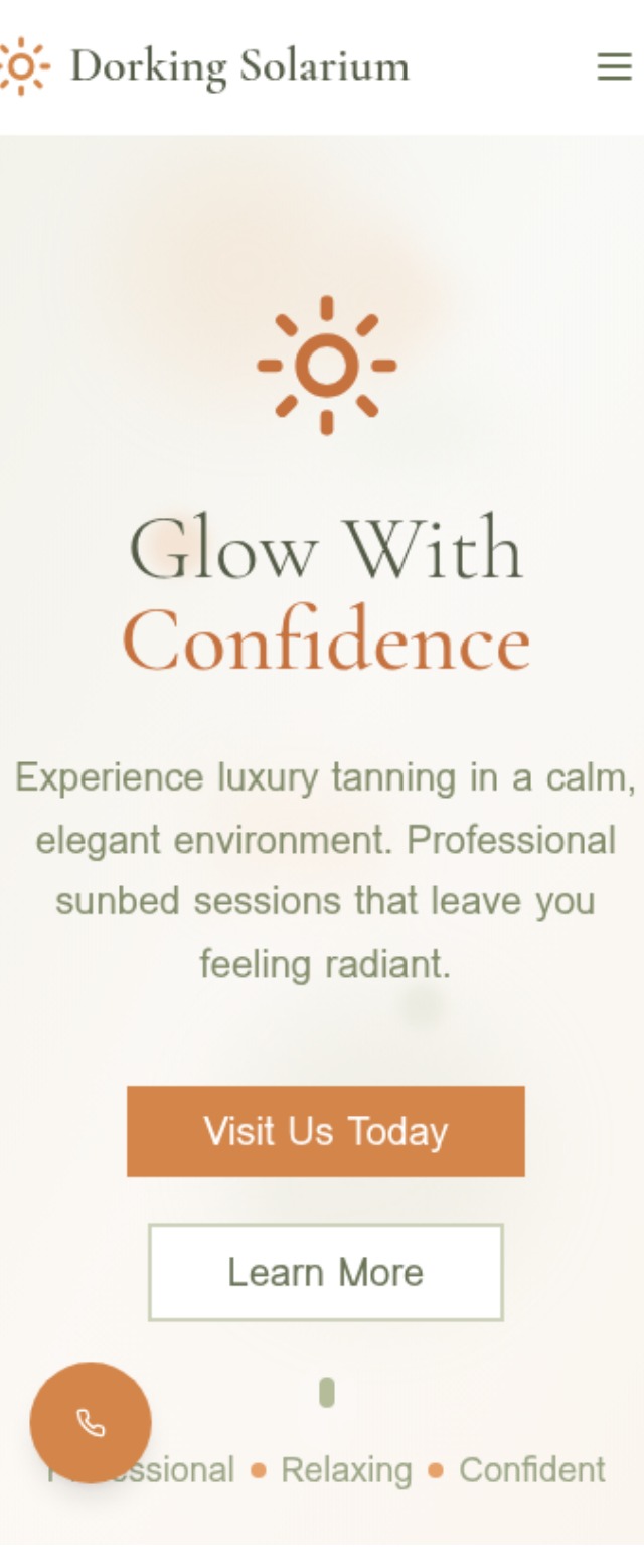
FIG. 05a · Mobile hero
A single tap to call — never more than a thumb-stretch away.
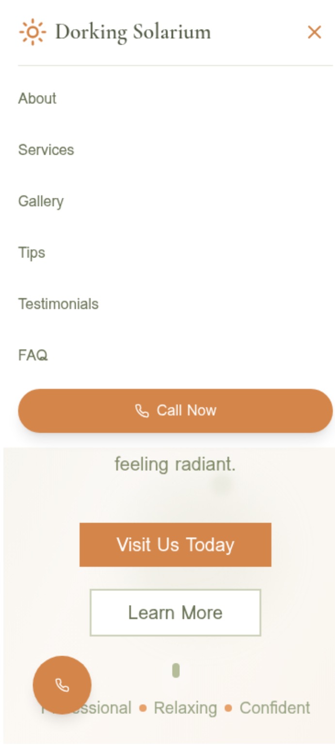
FIG. 05b · Mobile menu
Six destinations, one persistent action. The valuable choice is always the obvious one.
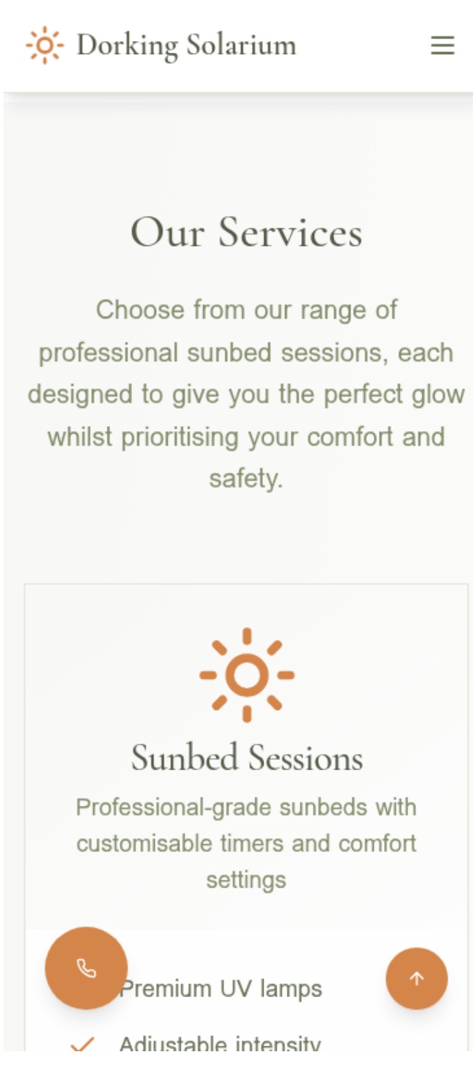
FIG. 05c · Mobile services
Full-width cards, no horizontal scroll, type that scales gracefully on smaller phones.
A quietly considered local-business presence — the digital version of walking in and feeling at ease.
My role
Brand & website lead — design, build, copy.
- 01Positioning and tone — a premium-but-approachable frame for a local service business that had been under-presenting itself.
- 02Information architecture sequenced around how first-time customers actually decide: who, what, where, who-trusts-them, how-to-book.
- 03Visual system — cream and deep sage palette, high-contrast serif paired with a quiet humanist sans, restrained weights, generous titles.
- 04Front-end build — responsive, mobile-first, real photography front-and-centre, a persistent call button on every screen.
- 05Copy shaping in plain British English — calm, factual, warm; no hype, no unverifiable claims.
- 06Conversion thinking — phone-first, friction-first, every primary action reachable with one thumb.
- 07Performance and on-page SEO — local search structure, structured data, image weight kept honest.
In summary
Status: designed, built and live at dorkingsolarium.com. No claims of uplift, session time or conversion rate are made here — the demonstrable work is a coherent visual system, a mobile-first build, a strong information architecture and a presentation that sits clearly above the local category norm.